U.S. golf Association ghin app
Modernizing the USGA's scoring app for golf's data-driven era

Elevating the golfing experience
The USGA GHIN app presents an exciting opportunity for a modern redesign—one that brings a fresh UI, richer data visualizations, and improved functionality to enhance the way golfers track their game.
With this concept project, my goal was to reimagine the experience with a more intuitive, data-driven approach, providing deeper performance insights while making in-round tracking seamless and effortless. Whether analyzing handicap trends or logging stats on the course, this redesign explores how a refined interface and smarter features could make improving your game easier—and more enjoyable.
Timeline
Over the course of three weeks, I analyzed the existing functionality through multiple rounds of golf, reviewed the existing page architecture, wireframed different concepts, and ultimately designed a broad, high-fidelity prototype of the redesigned app.
The Problem
While competitors in the golf app marketplace have popped up over the years, the USGA's signature app has fallen behind through a lack of features. This has become especially clear as advanced analytics have become more and more prominent in professional golf. Many apps offer key stats like performance history, strokes gained, comparative analysis, and more while the USGA merely offers a snapshot of your current status.
As the game of golf evolves, so do the analytics underlying each player's performance. While competitors have kept up with this evolution, the USGA has not. As a product, this is a huge market delta that needs to be closed.
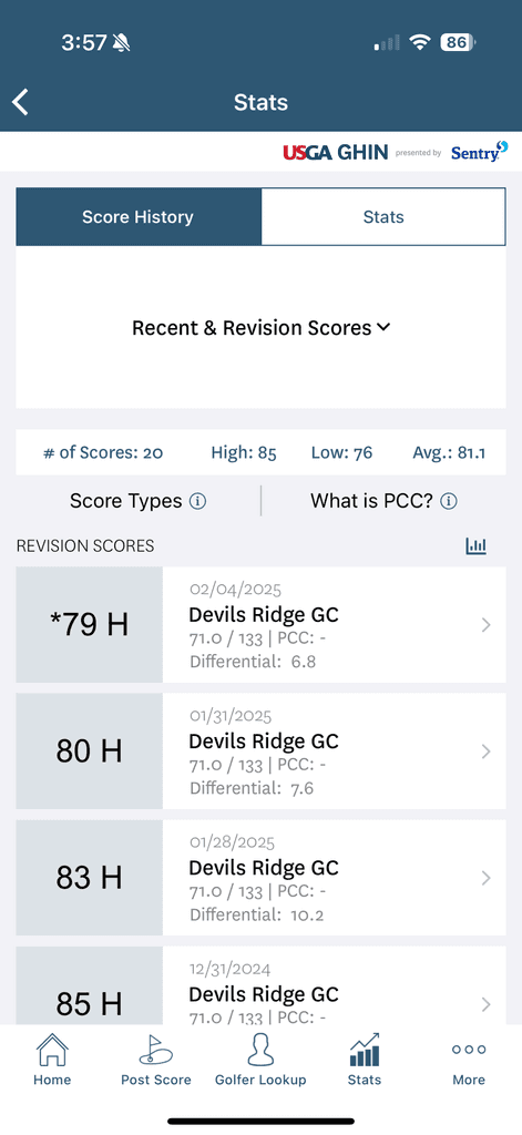
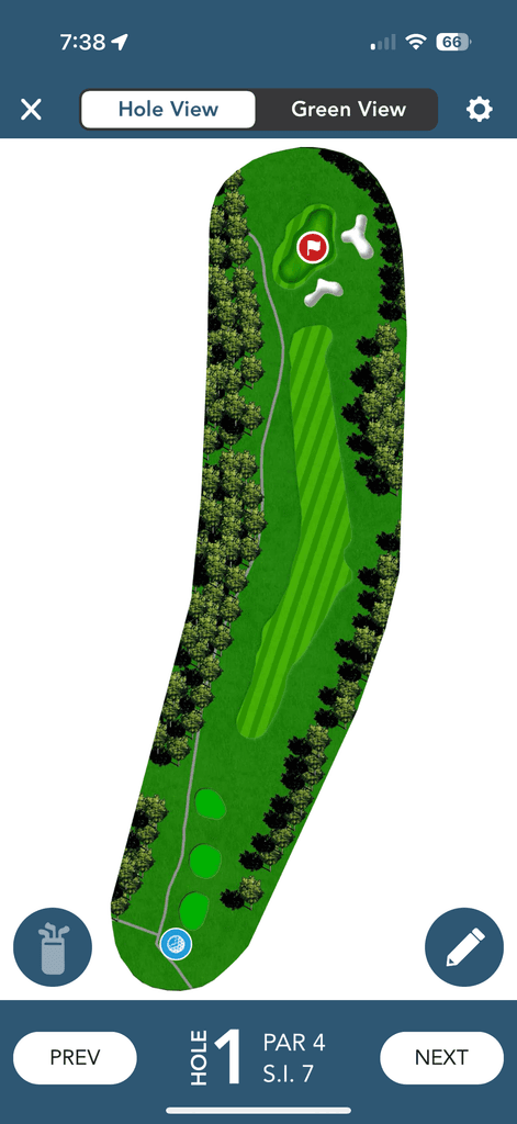
Handicap History
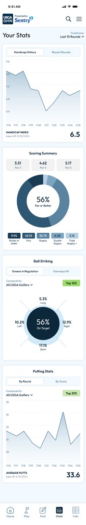
Currently, the first screen you see when you login is your handicap dashboard. A player card that shows a few player details and your Handicap Index, front and center. This only offers a snapshot of the moment rather than telling a story of player development. My design adds data visualization to show how the index has changed over time.
My Card
One of the key components of the app is the golfer's player card. The official data used to form the player's handicap index is useful for tournaments and other competitive matches. This handy consolidation of data was due for a revision as the existing page was difficult to scan. I revised the layout and added a color system to make them easier to scan for key elements.
Ball Striking & Putting
In order for any golfer to properly develop, they need to understand where they're going wrong. Ball Striking data is key for this kind of analysis. I designed radar charts to show the multi-directional bias of the golfer's tee shots, approach shots, and putting.

One of the more nuanced elements of UI design is maintaining functionality that works effectively while adding more flexibility. In order to improve the score posting feature, I designed custom icons and interactive radar buttons while maintaining the same data structure to minimize development time.
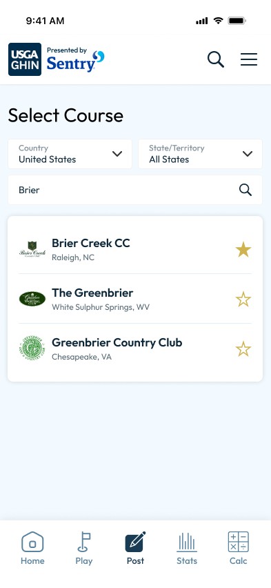
Course Selection
The existing course selection screen is bland and confines all of the action items in a small area at the top of the screen. I wanted to introduce more spacing here and enable the filters by default to ease the users actions.
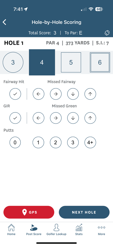
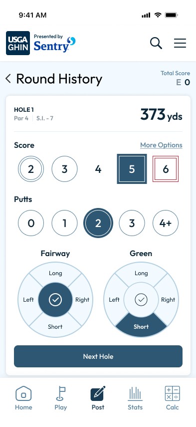
Entering Score
One issue with entering a score is that a golfer has no limit to what they can shoot, so the UI has to handle a wide range of options. I've seen as low as one and as high as fourteen – he refuses to talk about it. I also updated the Fairway and Greens inputs to be a multi-directional button to better visualize the outcome.
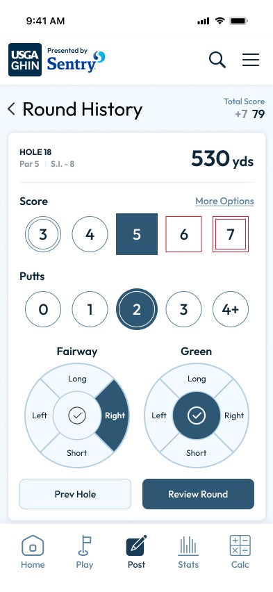
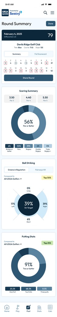
Round Summary
This page provided quality insights but it was clunky and difficult to read. My design revised the presentation of the key round details, and improved the data visualizations for putting, greens in regulation, and fairways hit.
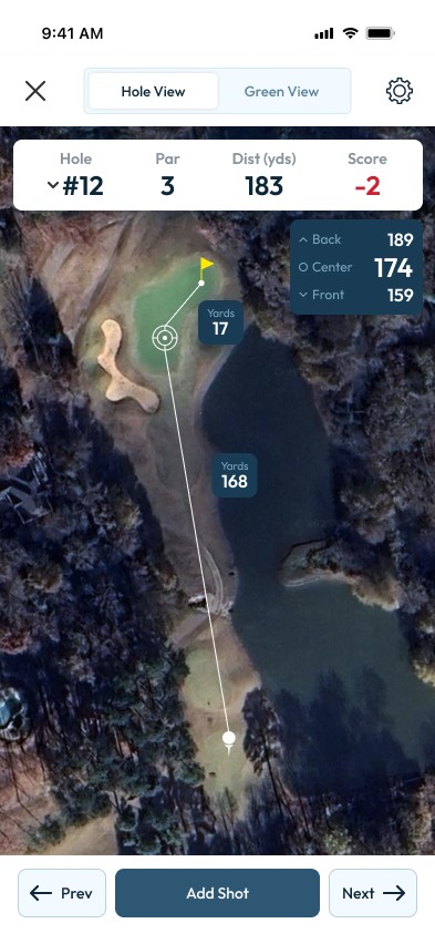
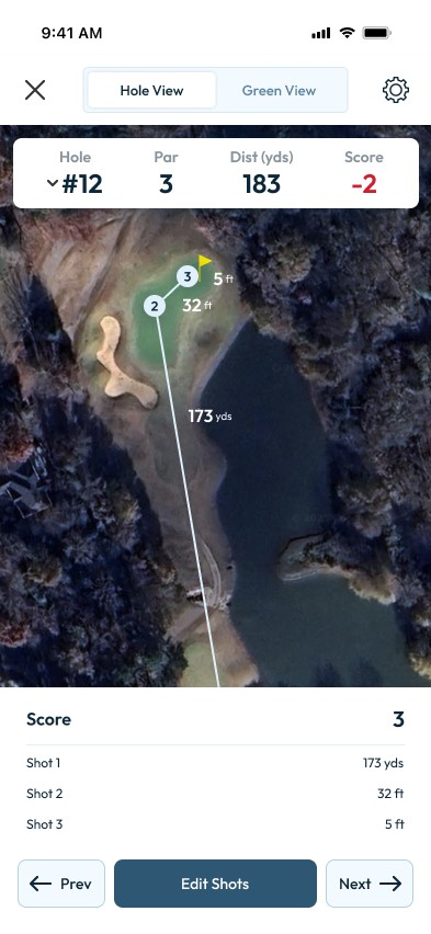
GPS shot tracking in golf has advanced quite a bit the last few years. Most are now using satellite imagery for more precise data. Incorporating the new technology meant updating the toolkit accordingly.
Shot Planner
Satellite imagery allows us to use more precise data so the user can see distances to different elements of the course like bunkers, water hazards, and out of bounds more easily. The refreshed aim mapping allows them to more accurately measure distances to danger when planning their shots.
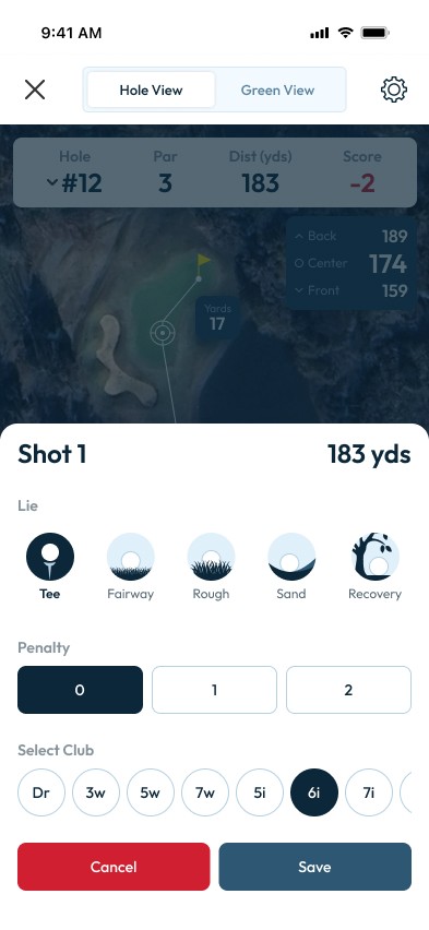
Adding Shots
Currently, the interface does not allow for tracking shots one by one. Adding this functionality allows the user to get more insights into their club usage, lie tendencies, and even distances per club. It also allows future flexibility to add Strokes Gained measurements.
Explore the prototype
Enjoy the prototype for yourself. Browse dozens of features like posting a score or playing with GPS functionality.
